CPBL Makes Minor Changes to the Logo
It appears that the CPBL had secretly made some slight adjustment to its logo and upgraded it from the fourth to the fifth generation.
So when did the league make the change? Based on Google Cache on the CPBL official website, it happened sometime between March 18 to 29 this year.
Goodbye, CPBL 4th Gen Logo: 2000-2021
The league has been using the fourth-generation logo since the 2000 season. The logo design concept is a player in a batting stance over the word CPBL.
![]()
Hello, CPBL 5th Gen Logo: 2022-Present
In terms of the design, the newly tweaked CPBL fifth-generation logo is not that far from the fourth generation. It is still a player in batting stance over the word CPBL.
However, when looking closer at it, there are some adjustments to the three primary colours (Blue, Red and Green). The new logo softened the colour tones to make it easier on the eyes.
There is also a change in the logo man’s batting stance, batting helmet and face outline. As for the font, the new logo filled up the dashed lines on the characters P and L. It also tidied up character B to make it less messy.
![]()
CPBL Alternate Logo for 2022 Season
Back on March 1, the CPBL unveiled their 2022 key visual, which contained a brand new alternate logo. The general feedback on that is it is much cleaner, sharper and more modernised.
It would be very interesting to see if the league ends up using the 2022 alt logo as their primary logo going forward.
![]()
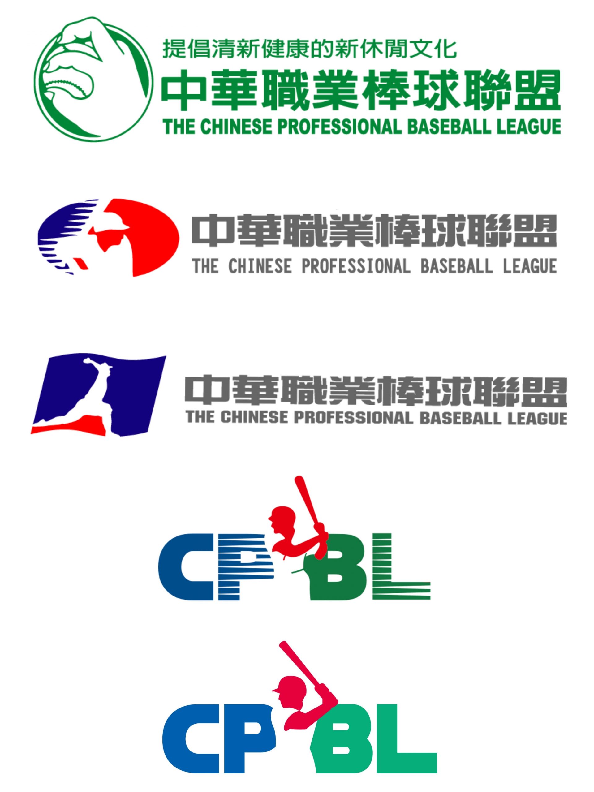
CPBL Logo Evolution: 1990 to Present
Below are all the CPBL logos since the inaugural season in 1990.
- 1st gen logo: 1990-1993
- 2nd gen logo: 1994-1997
- 3rd gen logo: 1998-1999
- 4th gen logo: 2000-2021
- 5th gen logo: 2022-Present