TSG Hawks’ Team Logo
He’s edgy. He’s in your face. He wears his cap backwards and with an attitude. You’ve heard the expression, “Let’s get busy.” Well, this is a hawk who gets biz-zay! Consistently and thoroughly.
No, we are not talking about Poochie from the Simpsons. Or Steve Buscemi going undercover as a high school student.
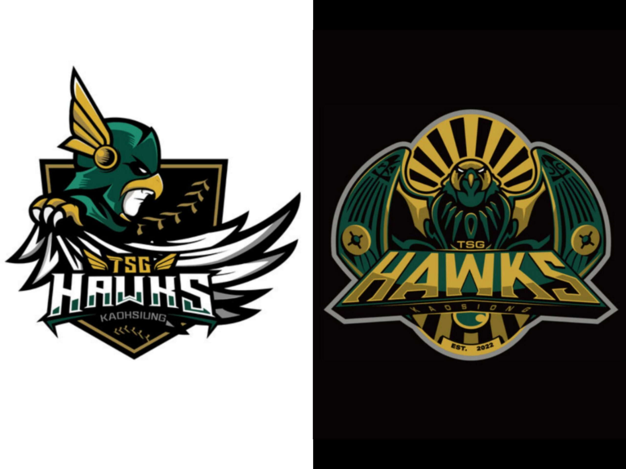
We are talking about the newest CPBL expansion team, the TSG Hawks’ team logo, which was unveiled on September 4!
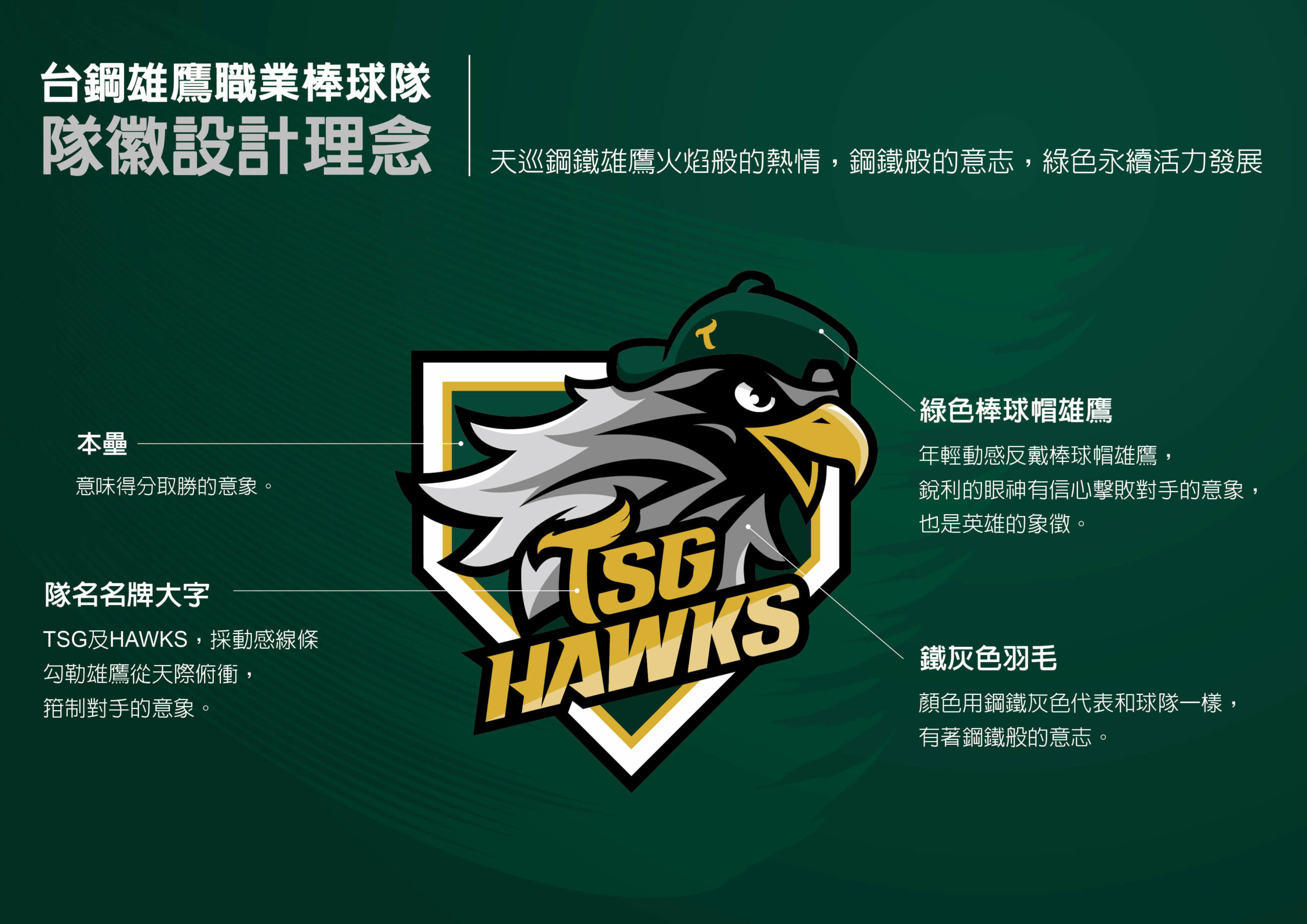
The Birth of the Hawks Logo
The TSG Hawks began their team logo project in January this year. Instead of hiring a competent professional design studio in Taiwan, they went down the route of crowdsourcing and asked the public to submit their Hawks team logo designs.
In May, after trimming the number of logo entries from 303 to 100, the Hawks started an online poll and asked the fans to vote for their favourite design.
After receiving more than 40,000 public votes and being evaluated internally by the team, the design “Sky Patrol Steel Hawks” ultimately won the logo design competition.
Shortly after announcing the winner, the Hawks took the winning design and made some minor modifications. A few months later, the TSG Hawks team logo was finally born!
TSG Hawks Logo Design Concept
According to the team, the team logo concept embodies fiery passion and steel-like determination. The hawk with a backward cap symbolised youth and vitality. Its sharp gaze represents confidence in defeating the opponents on the field.
The team also told the media that they plan to incorporate the new team logo into their uniforms in the near future.
According to my sources within the industry, this is what happened at the TSG Hawks' team logo meeting. 👀 pic.twitter.com/twjR0VNYTZ https://t.co/4WCZVHWzCc
— CPBL STATS 🪬🔮 (@GOCPBL) September 5, 2023
Rejected TSG Hawks Logos
Here are some of my personal favourite rejected TSG Hawks team logo designs that were submitted by the general public. Although I really liked the “Horus the Egyptian god and the Bird Man” logos, I can understand why the TSG Hawks did not go with those designs.
